06. between senses
Transferring the invisible senses such as sound, taste, smell, and time into physica form allows more people to register them at one time. This also involves exploring the spaces between two differing senses, such as visual and aural, or visual and the sense of taste. Such designs allow viewers to translate their visual perceptions into a different sensory perception, thereby creating a feeling of satisfaction not unlike when one solves a puzzle or quiz.
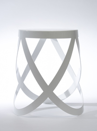
ribbon | 2007, Cappellini, steel
A stool whose construction loops together like the ribbons of ballet shoes. The three ribbons are laser-cut from a single layer of steel, and cross at a standard pitch for stability and structural integrity. The high stool has an extra loop, some of which can be used as footrests. The optional cushion affixes to the stool with magnets.
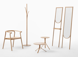
splinter | 2012, Conde House, wood
A furniture collection designed for Conde House, a manufacturer based in Japan’s famous Asahikawa wooden furniture region. We splintered each piece of wood as though peeling it away. Chairs’ backrests divide to become armrests and legs, and the top of the coat stand peels away to provide coat hooks. The side table’s stand splinter to turn into three legs. We kept larger pieces of wood at their original thickness to provide strength where necessary, and used thin pieces of wood that had splintered off for more delicate parts. We approached the wood gently, going with the grain so that the wood would retain its original pliancy.
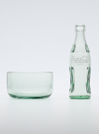
Bottleware ֻ| 2012, Coca-Cola, glass
Coca-Cola’s “contour bottle” has been a brand icon since its inception in 1916.It is also recyclable: after each use, the bottle can be collected, washed and refilled for further use. This tableware collection is made from bottles that have deteriorated over the course of extensive recycling, and can no longer be used for their original purpose. We were captivated by the particular green tint known as “Georgia Green, and by the fine air bubbles and distortions that are a hallmark of recycled glass, so decided to create simple shapes that would enhance these traits. But we also wanted users to feel a remnant of the distinctive bottle in the new products. Our solution was to create bowls and dishes that retain its distinctive lower shape, as though the top had been sliced off.
The dimpling on the bottle base that added to mitigate hot impacts during the production process is not ordinarily a strong visual feature, but it’s a particular characteristic of glass bottles and visible to anyone who picks up the bottle to drink. Keeping these ring-shaped dimples on the base of our bowls and plates also helps to convey important messages about the way that glass circulates between people as it’s made, used and recycled for further use, and about the connections it makes between people in this process.
The dimpling on the bottle base that added to mitigate hot impacts during the production process is not ordinarily a strong visual feature, but it’s a particular characteristic of glass bottles and visible to anyone who picks up the bottle to drink. Keeping these ring-shaped dimples on the base of our bowls and plates also helps to convey important messages about the way that glass circulates between people as it’s made, used and recycled for further use, and about the connections it makes between people in this process.
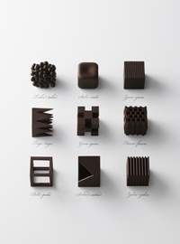
chocolatexture | 2015, Maison et Objet, Paris, chocolate
Cocoa’s country of origin, kind, percentage content, technique of the chocolatier’s, the flavours inside… There are many factors that determine a chocolate’s taste. In coming up with a new chocolate concept, we turned out attention not to such factors, but to the chocolate’s “shape.” The 9 different types of chocolate are made within the same size, 26x26x26 mm, featuring pointed tips, hollow interiors, smooth or rough surface textures – and, while the raw materials are identical, the distinctive textures create different tastes. Each chocolate is directly named after Japanese expressions used to describe texture.
1. “tubu-tubu” Chunks of smaller chocolate drops.
2. “sube-sube” Smooth edges and corners.
3. “zara-zara” Granular like a file.
4. “toge-toge” Sharp pointed tips.
5. “goro-goro” Fourteen connected small cubes.
6. “fuwa-fuwa” Soft and airy with many tiny holes.
7. “poki-poki” A cube frame made of chocolate sticks.
8. “suka-suka” A hollow cube with thin walls.
9. “zaku-zaku” Alternately placed thin chocolate rods forming a cube.
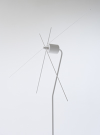
kazadokei | 2008, Museum of Contemporary Art Tokyo, steel
The kazadokei is a two-metre-tall clock with a second hand that measures 150cm. As these dimensions might suggest, the clock uses the same kind of mechanism employed in large timepieces for buildings and parks, rather than indoor wall or tabletop ones. When the hands of some faces align, the faces on their slender poles look like a hill of windmills. We’ve seen the clock’s raison d’etre shift from functionality to personal taste and design sensibility. Today, in an era when our perception of time is increasingly dulled, the kazadokei lets us experience time directly with our bodies and senses – and is a way of linking windmills, which revolve when they catch the wind, and clocks, which revolve when they catch time.
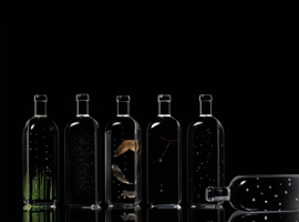
rain bottle | 2014, Maison et Objet, Paris, acrylic
A project for the Trend Exhibition space in the main area of Maison & Objet Paris, the twice-yearly design fair. The exhibition theme ‘Words’, asked designers to consider the relationship between language and design. We chose the word ‘rain’, but considered its many nuances in Japanese, a language that has dozens of words for rain depending on the condition and time of day, as a way to reflect the fine nuances and sensibilities of Japanese as a language.
The exhibit consists of clear acrylic bottles lined-up, each containing a different kind of ‘rain’. ’Kirisame’, ‘biu’ and ‘kosame’ refer to different degrees of fine drizzle, while ‘niwaka-ame’ is a sudden downpour. ‘Mizore’ is sleet, and a ‘yudachi’ falls in the evening. ‘Kisame’ is rain that drips from the ends of tree branches, and ‘kaiu’ is rain that falls mixed with dust and pollen. We also included seasonal rains, from the ‘samidare’ that falls in the spring, to ‘shigure’, rain specific to autumn and winter. By exhibiting twenty different kinds of ‘rain’, we hoped to express Japanese culture’s unique relationship to nature and the depth of this relationship.
The exhibit consists of clear acrylic bottles lined-up, each containing a different kind of ‘rain’. ’Kirisame’, ‘biu’ and ‘kosame’ refer to different degrees of fine drizzle, while ‘niwaka-ame’ is a sudden downpour. ‘Mizore’ is sleet, and a ‘yudachi’ falls in the evening. ‘Kisame’ is rain that drips from the ends of tree branches, and ‘kaiu’ is rain that falls mixed with dust and pollen. We also included seasonal rains, from the ‘samidare’ that falls in the spring, to ‘shigure’, rain specific to autumn and winter. By exhibiting twenty different kinds of ‘rain’, we hoped to express Japanese culture’s unique relationship to nature and the depth of this relationship.
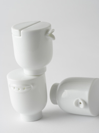
pyggy-bank | 2010, Isetan, ceramic
A piggy bank designed for the Isetan department store’s ‘Piggy Bank Collection’ exhibition, an official event for Design Tide Tokyo 2010. Unraveling the history of the piggy bank, we learn that the name dates back to medieval Europe, when unused coins were saved in household jars made of unglazed reddish clay, or ‘pygg’. A play on words from ‘pygg’ to ‘pig’ led to the piggy bank, and the familiar porcine objects we know today. The pyggy-bank takes this history as its design concept. Offering savers a pig-snouted bottle and jar made of unglazed fired clay in which to place their hard-earned coins, it exists somewhere between ‘pygg’ and the ‘pig’.
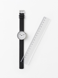
draftsman 01. scale | 2014, by | n, steel, glass, leather
A wristwatch series, inspired by the drafting instruments draftsmen use to prepare precise plans and drawings. The first watch, scale, borrows the layout of a calibrated ruler. The scale marks are printed directly on the crystal rather than on the face to emphasize the link to gradations. We hoped our design would function like a tool to help wearers measure time as they would measure length.
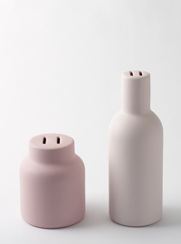
talking | 2007, h concept, ceramic
For these soy sauce, salt, and pepper containers, nendo decided to differentiate between the three through a combination of sight and sound, or words as sound.
Instead of relying on symbols and letters, the mouth of each container is the shape that a human mouth would make when saying the name of each product: “yu” for “shoyu”, which means “soy sauce” in Japanese, “shi” for “shio”, which means salt, and “ko” for “kosho”, which means “pepper”. In an age when we rely increasingly on e-mail for communication, and conversation fades from the dinner table, “talking” subtly links people and things through the power of the texture and sound of spoken Japanese.
Instead of relying on symbols and letters, the mouth of each container is the shape that a human mouth would make when saying the name of each product: “yu” for “shoyu”, which means “soy sauce” in Japanese, “shi” for “shio”, which means salt, and “ko” for “kosho”, which means “pepper”. In an age when we rely increasingly on e-mail for communication, and conversation fades from the dinner table, “talking” subtly links people and things through the power of the texture and sound of spoken Japanese.
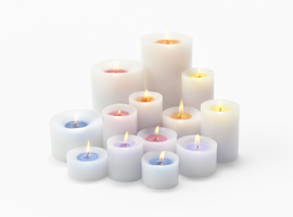
sunset | 2016, by | n, candle wax
It appears to be a normal white candle. But once lit, the centre of the candle begins to change colours as it burns: first to yellow, then orange, red, purple, and finally to blue. These colours reflect faintly off of the white wax surrounding the flame. The transition of colours is inspired by the shifting shades of light that paint the sunset sky. Each colour has its own accompanying scent: bergamot, lemongrass, sweet marjoram, lavender, and geranium. Not only does the candle provide illumination, but the transition of colours also serves as a reminder of the passage of time.